Why we like it: This is a unique solution to an old problem. We really like the use of drawing tools to collect information and Styled Maps to help the data stand out better.
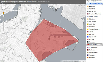
In almost every city, there is some disagreement as to where one neighborhood ends and another begins. Furthermore, as is often the case, reputable sources have differing neighborhood lines. In reality there are no physical lines on the ground clearly defining neighborhoods, however these hypothetical boundaries do have a real impact on local economies, politics, and identity. Bostonography has set out to solve this problem by creating a tool to collect as many neighborhood definitions as possible.
From the Bostonography website, “We want to map the collective definitions of Boston's neighborhoods by its residents and those who know the city well. This map is a tool for drawing top-level neighborhood boundaries … as you see them, and submitting them to a database that will be used to map the areas of agreement and disagreement among participants.”
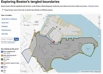
Bostonography has begun to parse the data and has calculated which neighborhoods have the most agreement and which have the most disagreement. The results of the first few data sets are stunning. To further illustrate how complex neighborhood definitions can be, this separate example by The Boston Globe shows just how “tangled” neighborhood boundaries are, even amongst city agencies!
If you have knowledge of Boston yourself, Bostonography encourages you to contribute to the map. “Submit a map of as many or as few neighborhoods as you wish, but we of course encourage you to draw all of them. Detail as intricate as you have patience for is appreciated, too, for the sake of the eventual maps of the results.”
So whether you’re from Southie or from Allston, we all can agree that this map is wicked awesome.
No comments:
Post a Comment